Yeah, it’s a hot take 🔥 and also click-baity. Recently my uncle asked if I like the new flag (it’s on my hat), while he was wearing this t-shirt:

So probably not racist, but he hasn’t come around to the new design yet, so I offered this same explanation you’ll find here… And if you aren’t a racist, you’ve at least got poor design taste, but maybe we can fix that 🤔 I’m going to try to convince you to fly the new flag on design principles alone. If you still think the new flag is woke, I probably can’t convince you to stop being racist 😥
If you’re truly flying the old flag because you can’t afford a new one, I’ve got a proposition for you at the bottom…
If you’re otherwise flying the old Minnesota flag, you’re doing it to make a statement. I’m not seeing it everywhere – mostly on well-to-do homes. The argument to keep the old flag posted is playing out in public, usually in suburban cites with aging populations that largely self-identify as conservative. One suburb concluded that flying no state flag was the best solution 🙃
Bad Flag Design
The old flag is a bad design. And to show what good vs. bad design looks like, watch this:
The old Minnesota flag, like many other state and city flags, break multiple tenants of design:
- Simple ❌
- Meaningful Symbolism ⚠️
- 2-3 Basic Colors ❌
- No Lettering or Seals ❌
- Be Distinctive or Related ❌
⚠️ The symbolism is where the old flag could be easily be seen as depicting white man “conquering” the natives. But honestly I think the old flag flyers are probably too dumb or ignorant to come to this conclusion themselves. Part of this is because those elements are hard to see vis-a-vis poor design. So I’m going to keep focusing on the design elements 😅
All of the old iterations of the Minnesota state flag were fantastic examples of “seals on a bed sheet” adopted by many other states. To prove my point, can you pick out your state flag from this grid if you only look at it for 5 seconds?
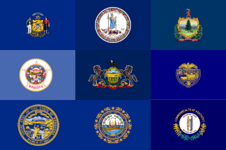
I removed the blatantly obvious text where the designers printed the state name – probably so you could identify it within the crowd. If you’re doing it right, no text is needed.
Good Flag Design
Here’s another grid with state flags that employ good design:
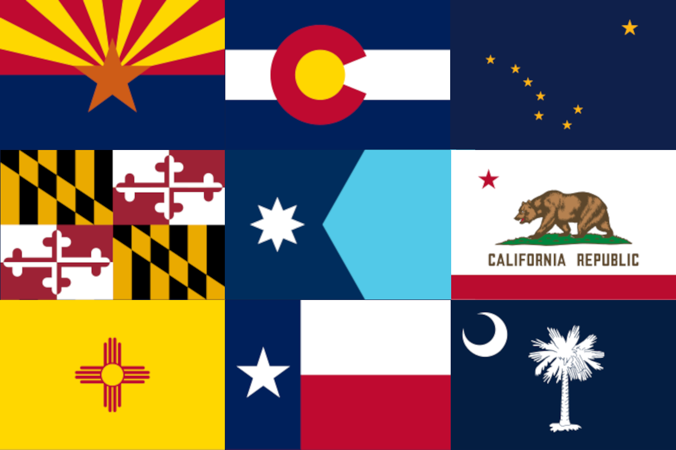
Many of these flags are immediately recognizable. Even if you can’t name all of the states they belong to, the people that live there recognize and can. This makes them a source of pride.
The new Minnesota flag literally checks all of the boxes:
- Simple ✅
- Meaningful Symbolism ✅
- 2-3 Basic Colors ✅
- No Lettering or Seals ✅
- Be Distinctive or Related ✅
What’s not to like about it?
Need an upgrade?
If you truly cannot afford one and need an upgrade, here’s my proposition. Comment on this post. I’ll reach out to you via email. You MUST have an old flag that you’re looking to replace and have a photo with your old flag alongside a date identifying document to prove it.
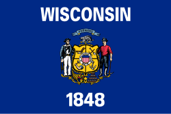
You also MUST live in Minnesota. I’m not starting a charity for drunken ‘sconnies to burn our flag. While you’re at it Wisconsin, maybe think about changing your flag – because it’s also just as ugly.
Leave a Reply